각 Axes객체는 2개 이상의 Axis 객체를 가짐
(2D chart일 경우, x-axis와 y-axis를 가지므로 2개임).
Axis는 주로
- 축의 scale과
- tick locator,
- tick formatter를 제어한다.
Scales
많이 사용되는 scale은 다음과 같음
'linear': linear scale로 숫자 그대로임.'log': log scale로 작은 수에서는 간격이 크나, 큰 수로 갈수록 간격이 줄어듬.
import numpy as np
import matplotlib.pyplot as plt

data1 = np.random.randn(100)
fig, axs = plt.subplots(1, 2, figsize=(5, 2.7), layout='constrained')
xdata = np.arange(len(data1))  # make an ordinal for this
data = 10**data1
axs[0].plot(xdata, data)

axs[1].set_yscale('log')
axs[1].plot(xdata, data)
보다 자세한 건 다음 URL을 참고 : https://matplotlib.org/stable/gallery/scales/scales.html
Scales — Matplotlib 3.7.2 documentation
Scales Illustrate the scale transformations applied to axes, e.g. log, symlog, logit. The last two examples are examples of using the 'function' scale by supplying forward and inverse functions for the scale transformation. import numpy as np import matplo
matplotlib.org
Tick locators and formatters
각 Axis object는 tick locator와 tick formatter를 가지고 있음.
참고로 scale이 다를 경우, 사용되는
- tick locator와
- tick formatter가 다름.
예를 들어 log scale에서는 LogLocator와 LogFormatter가 사용됨.
보다 자세한 건 다음 URL들을 참고 :
https://matplotlib.org/stable/gallery/ticks/tick-locators.html
Tick locators — Matplotlib 3.7.2 documentation
Tick locators Tick locators define the position of the ticks. This example illustrates the usage and effect of the most common locators. import numpy as np import matplotlib.pyplot as plt import matplotlib.ticker as ticker def setup(ax, title): """Set up c
matplotlib.org
https://matplotlib.org/stable/gallery/ticks/tick-formatters.html
Tick formatters — Matplotlib 3.7.2 documentation
Tick formatters Tick formatters define how the numeric value associated with a tick on an axis is formatted as a string. This example illustrates the usage and effect of the most common formatters. import matplotlib.pyplot as plt from matplotlib import tic
matplotlib.org
보통 Axes object의 set_xticks와 set_yticks helper methods를 통해 이들을 제어함.
import numpy as np
import matplotlib.pyplot as plt

data1 = np.random.randn(100)
xdata = np.arange(len(data1))

fig, axs = plt.subplots(2, 1, layout='constrained')
axs[0].plot(xdata, data1)
axs[0].set_title('Automatic ticks')

axs[1].plot(xdata, data1)
axs[1].set_xticks(np.arange(0, 100, 30), ['zero', '30', 'sixty', '90'])
axs[1].set_yticks([-1.5, 0, 1.5])  # note that we don't need to specify labels
axs[1].set_title('Manual ticks')
Plotting dates and strings
matplotlib의 Axis의 tick으로 dates와 strings를 처리할 수 있음 : 이를 위한
- special locators와
- formatters가 있음.
다음 예는 dates (NumPy에서 np.datetime64)를 x-축에 tick으로 사용한 경우를 보여줌.
import matplotlib as mpl
import numpy as np
import matplotlib.pyplot as plt

dates = np.arange(np.datetime64('2021-11-01'), # 2021-11-01 00:00:00
                  np.datetime64('2021-11-02'), # 2021-11-01 23:00:00
                  np.timedelta64(1, 'h'))
tmp = len(dates)/24 # 24

fig, ax = plt.subplots(figsize=(5, 2.7), layout='constrained')

data = np.cumsum(np.random.randn(len(dates)))
ax.plot(dates, data)
cdf = mpl.dates.ConciseDateFormatter(ax.xaxis.get_major_locator())
ax.xaxis.set_major_formatter(cdf)
날짜 등에 대한 tick을 처리하는 보다 자세한 내용은 다음 URL을 참고 : https://matplotlib.org/stable/gallery/text_labels_and_annotations/date.html
Date tick labels — Matplotlib 3.7.2 documentation
Date tick labels Matplotlib date plotting is done by converting date instances into days since an epoch (by default 1970-01-01T00:00:00). The matplotlib.dates module provides the converter functions date2num and num2date that convert datetime.datetime and
matplotlib.org
Categorical data
Categorical data의 경우는 bar chart로 그려지며 각 bar마다 해당하는 카테고리의 string이 출력됨.
(너무 많으면 축에서 서로 겹쳐서 제대로 안보임. 주의할 것)
import numpy as np
import matplotlib.pyplot as plt

fig, ax = plt.subplots(figsize=(5, 2.7), layout='constrained')
categories = ['turnips', 'rutabaga', 'cucumber', 'pumpkins']

ax.bar(categories, np.random.rand(len(categories)))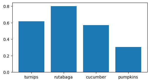
Categorical variable를 그리는 방법에 대한 보다 자세한 건 다음 URL을 참고 : https://matplotlib.org/stable/gallery/lines_bars_and_markers/categorical_variables.html
Plotting categorical variables — Matplotlib 3.7.2 documentation
Plotting categorical variables You can pass categorical values (i.e. strings) directly as x- or y-values to many plotting functions: import matplotlib.pyplot as plt data = {'apple': 10, 'orange': 15, 'lemon': 5, 'lime': 20} names = list(data.keys()) values
matplotlib.org
Additional Axis Object
같은 x-axis를 공유하지만, 서로 다른 y-axis를 가지는 2개의 graph를 동시에 그리는 경우, Axes.twinx를 활용한다.
해당 method는 같은 그리는 영역을 가지나 y-axis만 따로 가지는 Axes object를 반환한다. 해당 Axes object에서 plot method를 호출하여 그리면 됨.
다음 예제를 참고.
import numpy as np
import matplotlib.pyplot as plt

t = np.arange(0.0, 5.0, 0.01)
s = np.cos(2 * np.pi * t)

fig, ax1 = plt.subplots(figsize=(4, 3))
l1, = ax1.plot(t, s, 'b')
ax2 = ax1.twinx()
l2, = ax2.plot(t, range(len(t)), 'r')
ax2.legend([l1, l2], ['Sine (left)', 'Straight (right)'])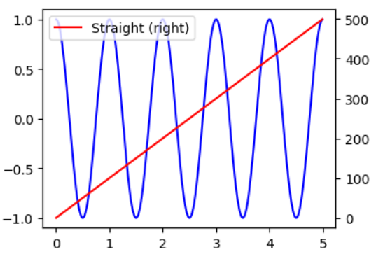
같은 y-axis를 공유하는 경우엔 Axes.secondary_xaxis를 이용하여 additional x-axis를 추가한다
(이 경우 보통 chart를 새로 그리진 않음).
이때 원래의 x-axis와의 값과의 변환을 수행할 수 있는 function들의 collection을 functions에 할당함.
import numpy as np
import matplotlib.pyplot as plt

t = np.arange(0.0, 5.0, 0.01)
s = np.cos(2 * np.pi * t)

fig, ax1 = plt.subplots(figsize=(4, 3))
ax1.plot(t, s)
ax1.set_xlabel('Angle [rad]')
ax2 = ax1.secondary_xaxis('top', functions=(np.rad2deg, np.deg2rad))
ax2.set_xlabel('Angle [°]')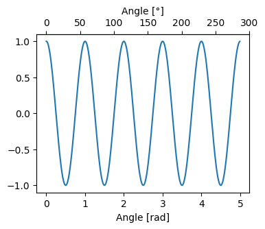
References
https://matplotlib.org/stable/tutorials/introductory/quick_start.html
Quick start guide — Matplotlib 3.7.2 documentation
Axes labels and text set_xlabel, set_ylabel, and set_title are used to add text in the indicated locations (see Text in Matplotlib Plots for more discussion). Text can also be directly added to plots using text: mu, sigma = 115, 15 x = mu + sigma * np.rand
matplotlib.org
'Python > matplotlib' 카테고리의 다른 글
| [matplotlib] : backend 란 (0) | 2023.07.20 |
|---|---|
| [matplotlib]: Figure and Axes (0) | 2023.07.20 |
| [matplotlib] : Styling Artists and Labeling Plots (0) | 2023.07.14 |
| [matplotlib] 계층구조 및 Container : Figure, Axes, Axis (0) | 2023.07.14 |
| [Python] Matplotlib Font설정 : 한글 사용하기 (colab). (0) | 2023.07.12 |


