Styling Artists
color, linewidth, linestyle 등의 스타일의 변경이 matplotlib의 Artists에서 가능함.
일반적으로 스타일 변경은 다음 두가지 방법으로 이루어짐.
Artist를 그리는 plot method를 호출할 때 argument로 넘겨주어 설정하는 방법- plot method가 호출될 때 반환하는 그려지는
Artistobject에 대해 스타일과 관련된 setter를 통해 설정하는 방법.
다음 코드는 matplotlib의 quick start에서 나온 예제로 위에서 언급한 첫번째 방법으로 line chart의 color과 linewidth, linestyle을 설정하는 예제와 두번째 방법으로 linestyle을 설정하는 예제를 보여줌.
import matplotlib.pyplot as plt
import numpy as np

data1,data2 = np.random.randn(2,100)
x = np.arange(len(data1))

fig, ax = plt.subplots(figsize=(5, 2.7))
ax.plot(x, np.cumsum(data1), color='blue', linewidth=3, linestyle='--')
l, = ax.plot(x, np.cumsum(data2), color='orange', linewidth=2)
l.set_linestyle(':')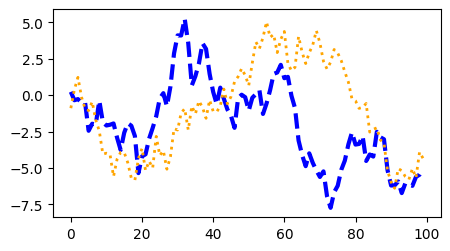
Linewidth and Linestyle
matplotlib에서 linewidth는 typographic points을 단위로 사용한다. (1pt = 1/72 inch = 0.353 mm)
많이 이용되는 linestyle은 다음과 같음.
'-' : solid':' : dotted'--' : dashed'-.' : dashdot
보다 자세한 건 다음 URL을 참고 : https://matplotlib.org/stable/gallery/lines_bars_and_markers/linestyles.html
Linestyles — Matplotlib 3.7.2 documentation
Linestyles Simple linestyles can be defined using the strings "solid", "dotted", "dashed" or "dashdot". More refined control can be achieved by providing a dash tuple (offset, (on_off_seq)). For example, (0, (3, 10, 1, 15)) means (3pt line, 10pt space, 1pt
matplotlib.org
Color
matplotlib는 다양한 방법으로 color를 지정할 수 있다. 많이 애용되는 것은 다음과 같음.
- RGB (or RGBA) 각각의 값을 ([0,1]) 범위의
float숫자로 지정한tuple을 이용하는 방법 :(0.1, 0.3, 0.7) - case-insensitive hex RGB (or RGBA) string :
'#0f0f10 - 기본적인 색들을 위한 Single character shorthand notation
'k': black'w': white'r': red'g': green'b': blue'y': yellow'c': cyan'm': magenta
보다 자세한 건 다음 URL을 참고 : https://matplotlib.org/stable/tutorials/colors/colors.html
Specifying colors — Matplotlib 3.7.2 documentation
Specifying colors Color formats Matplotlib recognizes the following formats to specify a color. Format Example RGB or RGBA (red, green, blue, alpha) tuple of float values in a closed interval [0, 1]. (0.1, 0.2, 0.5) (0.1, 0.2, 0.5, 0.3) Case-insensitive he
matplotlib.org
다음은 scatter-gram에서 원의 edge color와 내부 color를 다르게 나타낸 예제임.
fig, ax = plt.subplots(figsize=(5, 2.7))
ax.scatter(data1, data2, s=50, facecolor=(0.3,0.5,0.7), edgecolor='r')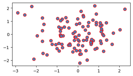
Markersizes and MarkerStyle
matplotlib에서 markersize는 typographic points를 단위로 사용하고 diameter 혹은 width로 지정한다.
import numpy as np
import matplotlib.pyplot as plt

X=np.linspace(0,100,20)
Y1=X**2
Y2=X**2+5000
Y3=X**2+10000
Y4=X**2+15000

fig, ax = plt.subplots(figsize=(5, 5))
ax.plot(X,Y1,marker='o', label='data1')              # default value
ax.plot(X,Y2,marker='d',markersize=2, label='data2')
ax.plot(X,Y3,marker='v',markersize=4, label='data3')
ax.plot(X,Y4,marker='s',markersize=6, label='data4') # default value
# ax.legend(loc='lower right')
ax.legend(loc='upper left')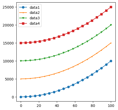
보다 자세한 marker에 대한 건 다음 URL을 참고 : https://matplotlib.org/stable/gallery/lines_bars_and_markers/marker_reference.html
Marker reference — Matplotlib 3.7.2 documentation
Marker reference Matplotlib supports multiple categories of markers which are selected using the marker parameter of plot commands: For a list of all markers see also the matplotlib.markers documentation. For example usages see Marker examples. from matplo
matplotlib.org
Labelling plots
Axes에서 많이 사용되는 text 정보들은 title고 축에 대한 label이다.
다음은 set_title, set_xlabel, set_ylabel 그리고 text를 사용한 예이다.
import numpy as np
import matplotlib.pyplot as plt

mu, sigma = 115, 15
x = mu + sigma * np.random.randn(10000)
fig, ax = plt.subplots(figsize=(5, 2.7), layout='constrained')
# the histogram of the data
n, bins, patches = ax.hist(x, 50, density=True, facecolor='C0', alpha=0.75)

ax.set_title('Aardvark lengths\n (not really)')
ax.set_xlabel('Length [cm]')
ax.set_ylabel('Probability')

ax.text(75, .025, r'$\mu=115,\ \sigma=15$')

ax.axis([55, 175, 0, 0.03]) # set range of x- and y- axis.
ax.grid(True)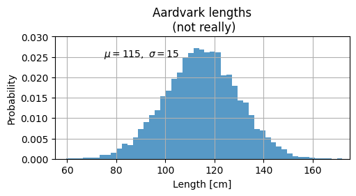
text에 대한 보다 자세한 설정은 다음 URL을 참고: https://matplotlib.org/stable/tutorials/text/text_props.html
Text properties and layout — Matplotlib 3.7.2 documentation
The base default font is controlled by a set of rcParams. To set the font for mathematical expressions, use the rcParams beginning with mathtext (see mathtext). Matplotlib can use font families installed on the user's computer, i.e. Helvetica, Times, etc.
matplotlib.org
위의 예제 코드에서 latex 을 이용하여 수식 및 특수기호 text를 출력했다.
이를 위해,
- raw string을 이용하여 back slash를 Python string에서 escape로 사용하지 않도록 하고
- $를 이용하여 latex expression임을 나타냄.
ax.text(75, .025, r'$\mu=115,\ \sigma=15$') : \(\mu=115,\ \sigma=15\)
Annotation
text처럼, annotation도 Axes 객체를 entry point로 삼는다. 가르키는 좌표를 xy로 설정하고, 해당 좌표에 대한 annotation text의 위치는 xytext롤 지정한다. 화살표에 대한 속성은 arrowprops에 dict를 넘겨주어 설정함.
import numpy as np
import matplotlib.pyplot as plt

fig, ax = plt.subplots(figsize=(5, 2.7))

t = np.arange(0.0, 5.0, 0.01)
s = np.cos(2 * np.pi * t)
line, = ax.plot(t, s, lw=2)

ax.annotate('local max', xy=(2, 1), xytext=(3, 1.5),
            arrowprops=dict(facecolor='black', shrink=0.05))

ax.set_ylim(-2, 2)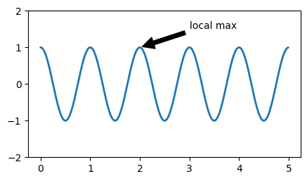
annotaton의 보다 자세한 사용법은 다음 url을 참고 : https://matplotlib.org/stable/tutorials/text/annotations.html#plotting-guide-annotation
Annotations — Matplotlib 3.7.2 documentation
text takes a bbox keyword argument, which draws a box around the text: fig, ax = plt.subplots(figsize=(5, 5)) t = ax.text(0.5, 0.5, "Direction", ha="center", va="center", rotation=45, size=15, bbox=dict(boxstyle="rarrow,pad=0.3", fc="lightblue", ec="steelb
matplotlib.org
Legends
역시 Axes객체를 entry point로 삼는다. Figure객체에 대해 legend를 호출시 기준으로 잡는 범위가 figure 전체가 되는 차이가 있다.
import numpy as np
import matplotlib.pyplot as plt

data1,data2,data3 = np.random.randn(3,100)
x = np.arange(len(data1))

fig, ax = plt.subplots(figsize=(5, 2.7))
ax.plot(np.arange(len(data1)), data1, label='data1')
ax.plot(np.arange(len(data2)), data2, label='data2')
ax.plot(np.arange(len(data3)), data3, 'd', label='data3')
ax.legend()
# fig.legend()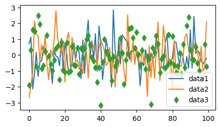
보다 자세한 내용은 다음 url을 참고할 것 : https://matplotlib.org/stable/tutorials/intermediate/legend_guide.html
Legend guide — Matplotlib 3.7.2 documentation
Legend guide Generating legends flexibly in Matplotlib. This legend guide is an extension of the documentation available at legend() - please ensure you are familiar with contents of that documentation before proceeding with this guide. This guide makes us
matplotlib.org
Reference
이 문서는 quick start를 기반으로 작성된 것임.
https://matplotlib.org/stable/tutorials/introductory/quick_start.html
Quick start guide — Matplotlib 3.7.2 documentation
Axes labels and text set_xlabel, set_ylabel, and set_title are used to add text in the indicated locations (see Text in Matplotlib Plots for more discussion). Text can also be directly added to plots using text: mu, sigma = 115, 15 x = mu + sigma * np.rand
matplotlib.org
'Python > matplotlib' 카테고리의 다른 글
| [matplotlib] : backend 란 (0) | 2023.07.20 |
|---|---|
| [matplotlib]: Figure and Axes (0) | 2023.07.20 |
| [Python] matplotlib : Axis Scale and Ticks (0) | 2023.07.14 |
| [matplotlib] 계층구조 및 Container : Figure, Axes, Axis (0) | 2023.07.14 |
| [Python] Matplotlib Font설정 : 한글 사용하기 (colab). (0) | 2023.07.12 |


