728x90
반응형
DataFrame Plot 주요 차트
- Line/Bar/Area : trend & 비교
- Hist/Box : 분포
- Scatter : 상관관계
- Pie : 비율
DataFrame.plot.* 과 Series.plot.*는 같은 백엔드(matplotlib)를 사용.
line,bar,barh,hist,box,area,pie는Series에도 동일하게 사용 가능.- 단,
scatter는Series에는 없음 (왜냐하면scatter는 최소 2개 축(x,y)이 필요하기 때문).
아래에 나온 방식외에도 다음의 방식도 사용되기도함:
# df.iloc[:20, :4].plot(title="Default df.plot() = Line Plot")
df.plot(kind="line")      # 선 그래프 (기본값)
df.plot(kind="bar")       # 막대 그래프
df.plot(kind="barh")      # 가로 막대
df.plot(kind="hist")      # 히스토그램
df.plot(kind="box")       # 박스 플롯
df.plot(kind="area")      # 면적 그래프
df.plot(kind="scatter", x="A", y="B")  # 산점도
df.plot(kind="pie", y="C")             # 파이 차트
df.plot(kind="...")은 곧바로
df.plot.XXX()를 호출하는 shortcut
각 차트 plot의 Signature & 주요 옵션
- 차트 종류마다 전용 옵션 존재.
- 각 함수는 kwargs를 통해 크기(figsize), 제목(title), 색상(color), 투명도(alpha), 범례(legend) 같은 공통 옵션을 제어:
kwargs로
모든 차트에서 인자로 받는kwargs는 결국matplotlib인자를 그대로 넘기고 있음.
다음은 EDA에서 많이 쓰는 것들 위주로 정리함.
1. Line Plot (기본값)
DataFrame.plot.line(x=None, y=None, **kwargs)x: x축 column (기본:index)y: y축 column (리스트 가능, 기본: 모든 수치형 column)
자주 쓰는 kwargs
figsize=(w,h) : 그래프 크기title="...": 제목style="--o": 선 스타일/마커 (matplotlib 표기법)color=["r","g","b"]: 선 색상 지정grid=True: 격자 표시
import pandas as pd
import matplotlib.pyplot as plt
from sklearn.datasets import load_iris

iris = load_iris(as_frame=True)
df = iris.frame
df["species"] = df["target"].map(dict(enumerate(iris.target_names)))

# 첫 20개 샘플만
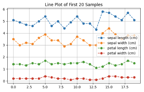
df.iloc[:20, :4].plot.line(
    figsize=(7,4),
    title="Line Plot of First 20 Samples",
    grid=True,
    style="--o"
)
plt.show()style="--o": 점 + 점선grid=True: 격자 표시
2. Bar Plot (세로)
DataFrame.plot.bar(x=None, y=None, **kwargs)x: x축 (보통 범주형 column)y: y축 (수치형 column)
자주 쓰는 kwargs
stacked=True: 누적 막대width=0.8: 막대 두께color=["skyblue","salmon"]: 막대 색상legend=True/False: 범례 표시 여부
df.groupby("species").mean().plot.bar(
    figsize=(7,5),
    stacked=False,
    title="Mean Feature Values by Species",
    rot=0
) # 목적: 그룹별 평균 값 비교
plt.show()stacked=False: 독립 막대rot=0: x축 레이블 회전 각도
3. Barh Plot (가로)
DataFrame.plot.barh(x=None, y=None, **kwargs)- `bar와 동일하지만 가로 방향
자주 쓰는 kwargs
stacked=True: 누적 막대height=0.8: 막대 높이color="lightgreen": 색상
df.groupby("species").mean().plot.barh(
    figsize=(7,5),
    stacked=True,
    title="Mean Feature Values by Species (Horizontal)"
) # 목적: 가로 방향에서 그룹 비교
plt.show()stacked=True: 누적 막대
4. Histogram
DataFrame.plot.hist(column=None, by=None, bins=10, **kwargs)column: 분석할 column (리스트 가능)bins: 구간 수
자주 쓰는 kwargs
alpha=0.7: 투명도 (겹침 확인에 유용)density=True: 빈도 대신 확률밀도 표시stacked=True: 여러 column을 겹치지 않고 누적
df.plot.hist(
    y="petal length (cm)",
    bins=20,
    alpha=0.7,
    grid=True,
    title="Histogram of Petal Length"
) # 목적: 특정 feature의 분포 확인
plt.show()bins=20: 구간 수alpha=0.7: 투명도
4. Kernel Density Esitimation (KDE)
- KDE는 연속형 데이터의 확률밀도함수(PDF)를 부드러운 곡선 형태로 추정하는 기법
- hist()가 구간을 나눠 빈도를 세는 방식이라면, kde()는 이를 매끄러운 곡선으로 표현
DataFrame.plot.kde(bw_method=None, ind=None, **kwargs)- bw_method: 대역폭(bandwidth) 조절
- 값이 작을수록 곡선이 세밀 (과적합 위험)
- 값이 클수록 곡선이 매끄러움 (과대평활 위험)
- ind: x축 범위나 샘플 수 지정
- int → 해당 개수만큼 균등 분할
- array → 사용자가 직접 지정한 좌표
- kwargs: color, style, alpha, title 등 matplotlib 옵션
df.iloc[:, :4].plot.kde(
    figsize=(7,5),
    title="KDE of Iris Features",
    lw=2  # line width
)
5. Box Plot
DataFrame.plot.box(by=None, **kwargs)by: 그룹핑 기준 column
자주 쓰는 kwargs
grid=True: 격자 표시notch=True: 중위수 notch 표시vert=False: 가로 box plot
df.plot.box(
    figsize=(6,5),
    grid=True,
    title="Box Plot of Iris Features"
) # 목적: 분포 범위, 이상치 탐지
plt.show()grid=True: 격자 표시notch=True: 중위수 notch 표시
6. Area Plot
DataFrame.plot.area(x=None, y=None, stacked=True, **kwargs)stacked=True: 기본 누적 면적
자주 쓰는 kwargs
alpha=0.4: 투명도stacked=False: 독립 면적 표시colormap="viridis": 색상 팔레트
df.iloc[:20, :4].plot.area(
    alpha=0.4,
    stacked=False,
    figsize=(7,4),
    title="Area Plot (Non-Stacked)"
)
plt.show() # 목적: feature 크기 비교alpha=0.4: 투명도stacked=False: 독립 면적
7. Scatter Plot
DataFrame.plot.scatter(x, y, s=None, c=None, **kwargs)x, y: 필수 (두 column)s: 점 크기c: 색상 (Series나 값 가능)
자주 쓰는 kwargs
colormap="viridis": 색상 맵핑alpha=0.6: 점 투명도marker="x": 점 모양
df.plot.scatter(
    x="sepal length (cm)",
    y="petal length (cm)",
    c="petal width (cm)",
    colormap="viridis",
    alpha=0.7,
    title="Scatter Plot: Sepal vs Petal"
) # 목적: feature 간 상관관계 확인
plt.show()
c="petal width (cm)": 색상 변수colormap="viridis": 컬러맵
8. Pie Chart
DataFrame.plot.pie(y=None, subplots=True, labels=None, **kwargs)y: 단일 column 지정subplots=True: 여러 column을 각각 pie로 그림
자주 쓰는 kwargs
autopct="%.1f%%": 비율 표시startangle=90: 시작 각도 (보통 90도로 설정)legend=False: 범례 표시 여부shadow=True: 그림자 효과
df.groupby("species")["petal length (cm)"].count().plot.pie(
    autopct="%.2f%%",
    ylabel="",
    startangle=90,
    title="Sample Count by Species"
) # 목적: 범주별 비율 비교
plt.show()autopct="%.2f%%": 퍼센트 표시startangle=90: 위쪽부터 시작
같이보면 좋은 자료
2025.05.16 - [Python/pandas] - [ML] pandas.DataFrame 에서 EDA에 적합한 메서드 요약
[ML] pandas.DataFrame 에서 EDA에 적합한 메서드 요약
Pandas DataFrame에서 탐색적 데이터 분석(EDA)에 사용할 수 있는 주요 메서드들은 다음과 같음:2024.05.18 - [분류 전체보기] - [ML] Exploratory Data Analysis (EDA) [ML] Exploratory Data Analysis (EDA)Exploratory Data Analysis (
ds31x.tistory.com
728x90
'Python > pandas' 카테고리의 다른 글
| DataFrame객체를 파일로 저장하기-csv-excel-json (0) | 2025.09.26 |
|---|---|
| pandas.read_excel() 함수: (0) | 2025.09.26 |
| [Pandas] isin() 메서드: 가독성 높은 boolean mask 만들기. (2) | 2025.08.28 |
| [Pandas] Boolean Mask 와 where()/mask() (1) | 2025.08.28 |
| [Pandas] index 와 columns- 관련 메서드: rename(), set_index(), reset_index() (0) | 2025.08.24 |


